Widgets
Challenge
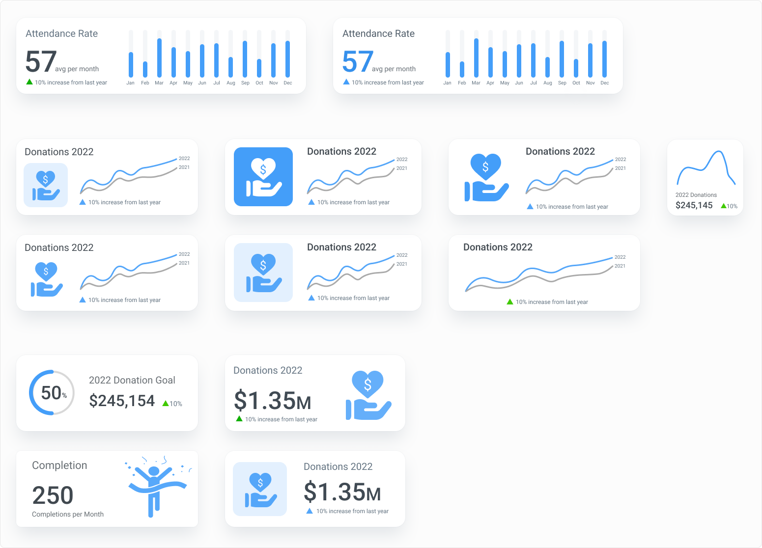
The current dashboard widgets for the company’s charts and KPIs are outdated and do not provide good visualization from an aesthetic and perspective. The challenge was to update the most commonly used components to display data better and be more visually appealing.
Approach
I analyzed the most common widgets used in the application and researched industry best practices and designs to display data. All mocks were designed with a blue theme to help prevent color from affecting the selection of one design over another based on color.
Insights
Font size, weight, and color can help to provide information architecture in widgets and accentuate primary vs. secondary information. The use of icons as visual elements, versus photos, is an easy to provide visual appeal, and color, and reinforce the theme of the KPI.
(click image for best view)